
Have you ever wondered if one candle could really shift your trading game? Candlestick analysis takes everyday price details and turns them into clear clues about market sentiment. Green candles tell you that buyers are stepping forward, while red candles signal that sellers are taking control.
In this post, we're digging into how these charts offer real-time hints to guide your trades. We'll walk you through the process, from spotting emerging trends to predicting shifts, so you can make smarter calls when trading stocks. Who knows? These insights might just change the way you view market moves.
Applying Candlestick Analysis to Stock Market Trends
Candlestick charts break down market activity by showing key price points, the open, high, low, and close, for a specific period. When a candle turns green, it tells you buyers are in control, pushing prices upward; a red one indicates sellers are stepping in. This straightforward tool gives traders a clear, real-time look at price movements. For example, a string of green candles may signal a rising trend, but a sudden red candle following that run could hint at a shift in momentum.
Traders often use pattern spotting, like identifying a doji or hammer, to navigate their entry and exit timing. These patterns, when combined with a solid read on price behavior, act like signposts pointing to what might come next. Focusing on daily or weekly charts can cut through the constant minute-by-minute noise, helping you craft strategies that work over the long haul.
Curious how these techniques fit into broader trading strategies? Dive into detailed insights on stock market analysis that show you how this method translates across different asset types, whether equities, forex, crypto, or derivatives, ultimately paving the way for smart, profitable decisions.
Deconstructing Stock Market Candlestick Chart Components

A candlestick packs four data points, open, high, low, and close, that together tell you a story about the market’s mood. The candle’s body shows the gap between the opening and closing prices, giving you an instant snapshot of how traders felt during that period. For instance, a small body after a heavy selling day might reveal that traders were a bit hesitant.
The lines reaching above and below the body, known as shadows or wicks, highlight the session’s highest and lowest prices. Imagine seeing an especially long upper shadow; it hints that buyers pushed for higher prices but ran up against strong resistance.
The color coding is simple. A green candlestick means the close was higher than the open and signals a bullish trend, while a red one indicates a bearish move. Each part of the candlestick acts like a visual cue, helping traders quickly understand the market’s short-term direction.
Identifying Bullish and Bearish Candlestick Patterns in Stocks
Candlestick patterns give you important clues about where the market might be headed. Think of the Hammer pattern as a friendly heads up: it shows up at the bottom of a downtrend as a single candle with a long lower wick, at least twice the length of its body. It’s like seeing a buyer step in when prices seem to have hit rock bottom.
Then there’s the Inverted Hammer, which works pretty much the same way but has a long upper shadow instead. This tells you that even if the day began with lower prices, buyers might be slowly gaining control. And if you spot a Doji, where the opening and closing prices almost match, it suggests that the market is pausing and buyers and sellers are on the fence. When a Doji appears after a strong move, it’s a cue to watch for more signs before making a move.
Now, let’s move to patterns involving two candles. The Bullish Engulfing pattern is particularly eye-catching: here, a green candle completely covers the previous red candle. This is a strong hint that buyer confidence is rising. On a similar note, the Piercing Line starts with a green candle that opens below the prior red candle’s low and then climbs to close above its midpoint, a nudge that a momentum shift might be on the way.
On the flip side, bearish patterns also send clear signals. The Hanging Man appears at the peak of an uptrend with a long lower wick, suggesting that the market might be primed for a reversal. The Dark Cloud Cover is another red flag, it’s when a red candle opens above the previous green candle’s high but then falls below its midpoint, hinting that sellers are starting to take charge. Lastly, the Bearish Engulfing pattern, where a red candle overtakes a preceding green one, shows that selling pressure is strong and the market might soon slide downward.
Multi-Candle Strategies and Continuation Patterns in Stock Market Candlesticks
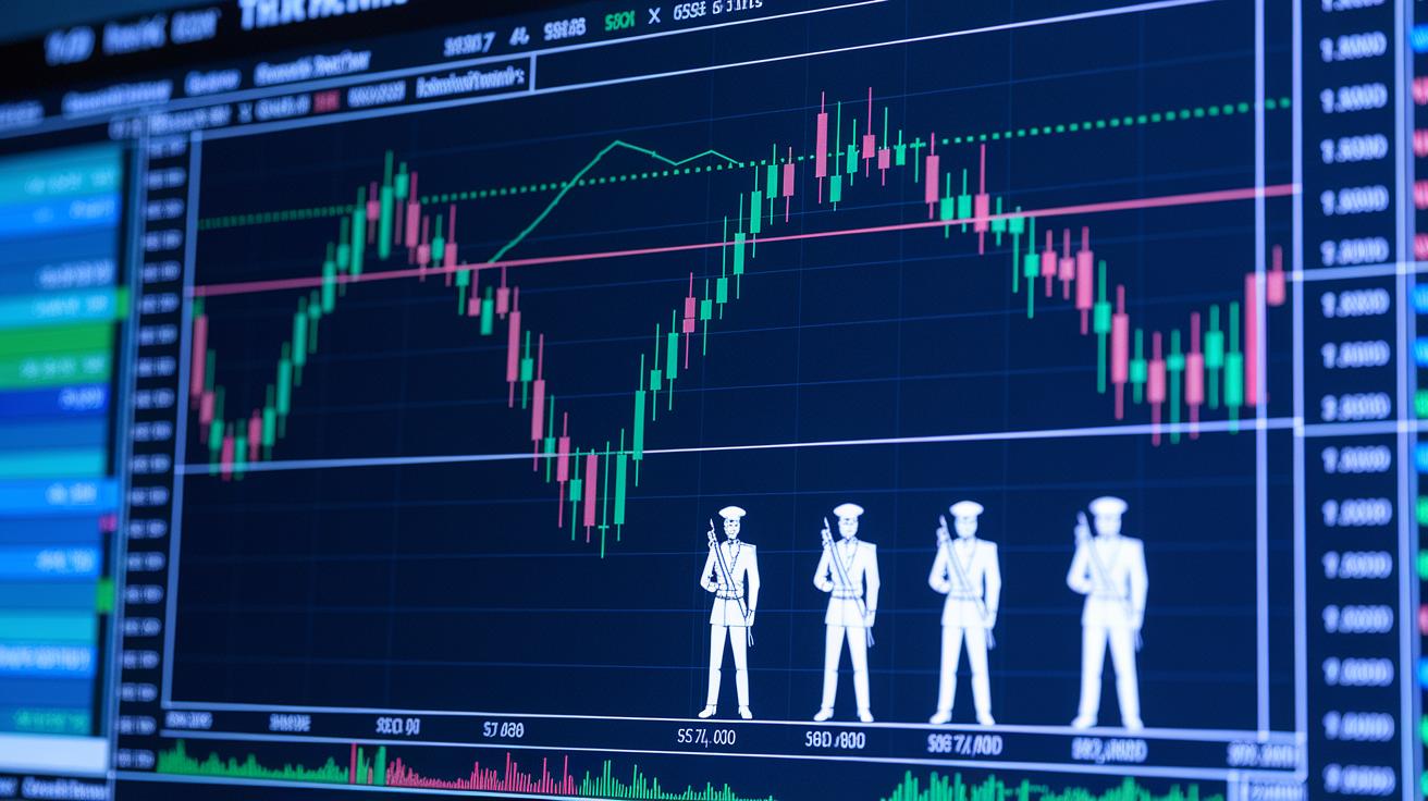
Multi-candle formations give traders a clearer picture of market mood by examining a sequence of price moves. Take the Morning Star pattern, for instance. This trio of candles has a small one sandwiched between two bigger ones and usually points to a bullish turnaround after a downtrend. Imagine a sudden surge in activity when selling pressure starts to ease up. In a similar way, the Evening Star pattern uses the same setup to signal a bearish reversal when an uptrend peaks, with a tiny candle tucked between strong bullish and bearish candles.
Traders also keep an eye on patterns that extend the current trend. The Three White Soldiers, for example, show three consecutive green candles that each close higher, suggesting the uptrend is set to continue. Conversely, the Three Black Crows feature three red candles that progressively drop, indicating further weakness. Then there’s the Rising Three Methods, where a few small bearish candles appear between two bullish ones, hinting that the upward movement is still on track. And the Tasuki Gap pattern shows a gap that is later filled by a confirming candle, reinforcing the ongoing trend.
| Pattern | Type | Candles Involved |
|---|---|---|
| Morning Star | Bullish reversal | 3 candles |
| Evening Star | Bearish reversal | 3 candles |
| Three White Soldiers | Bullish continuation | 3 candles |
| Three Black Crows | Bearish continuation | 3 candles |
| Rising Three Methods | Bullish continuation | Multiple candles |
| Tasuki Gap | Continuation pattern | Gap with confirming candle |
Integrating Candlestick Signals with Volume and Moving Averages
Candlestick patterns offer a helpful peek into market trends, but pairing them with volume data and moving averages makes your analysis even sharper. When you notice a bullish engulfing pattern and a sudden spike in volume, it's like the market is giving you a big thumbs-up that buyers are jumping in. Imagine seeing a green candle paired with a volume surge, it’s the market’s way of cheering you on, suggesting that the breakout could be strong.
Moving averages, such as the 50- and 200-period lines, act like moving support or resistance levels. Picture a scenario where a stock’s price closes above the 50-period average right after a doji pattern, it subtly hints that the market might be gearing up for a rise. Experts often recommend steering clear of uncertain patterns like dojis or spinning tops unless they confirm their strength against these moving averages.
This double-check approach helps you filter out false signals and fine-tune your entry and exit timing, making your trading decisions more reliable and robust.
Implementing Candlestick Analysis for Trading and Risk Management

Integrating candlestick analysis into your trading plan can really pay off. One simple method to try is the 3-Candle Rule. Basically, you watch for three candles in a row that follow a specific pattern. For example, if you spot three bullish candles after a run of down days, it might mean the market is starting to turn around.
For traders who focus on the day, the 5-Minute Candle Strategy offers clear signals for when to enter and exit trades. This approach zeroes in on important reversals within five minutes, providing sharp cues amid the day's ups and downs. When you use this strategy, remember to set a stop-loss order just beyond the extreme of the candle. Think of it as a safety net that kicks in if the price takes an unexpected turn.
Many experienced traders lean towards using daily charts because they help cut through the noise and confirm stronger trends. Combining these with shorter timeframes can refine your entries and boost confidence. Regularly reviewing your daily charts also reinforces disciplined risk management, which can improve your overall performance. For more details on building a systematic trading plan, check out our market analysis guide. These methods work together to balance opportunities and caution, creating a robust trading strategy.
Selecting Timeframes and Charting Tools for Stock Market Candlestick Analysis
Picking the right timeframe is a game changer when you’re reading candlestick charts. Daily and weekly charts offer signals you can trust, cutting through the usual market noise to show a clearer picture of what’s happening. On the other hand, if you’re into scalping and need pinpoint accuracy on entries and exits during fast price moves, lower timeframes like the 5-minute or 15-minute charts are your best friends.
Most modern trading platforms now feature interactive charts that update in real time. This means you get the latest data on intraday activity, option chains, and even your own watchlists, all of which help you act quickly and confidently. And if you’re just starting out or like to play around with different setups, many platforms include a free chart maker tool that lets you experiment with layouts and timeframes.
There’s more, API-driven charting tools can automate signal alerts and fine-tune your position sizing with handy custom calculators, like SIP and margin calculators. For example, many traders love a smooth TradingView setup that lets them switch between quick scalping setups and long-term strategies effortlessly. In fact, mixing higher and lower timeframes might just be the secret sauce to making smarter, more profitable trades. Give different setups a try and see what works best for you.
Final Words
In the action, traders use candlestick charts to read price movements through both bullish green and bearish red signals. We explored how individual patterns and multi-candle setups guide trade decisions, covering key elements like the Doji, Hammer, and engulfing patterns. Incorporating volume and moving averages further sharpens these insights for effective risk management. This stock market candlestick analysis method helps decode price action clearly, empowering you with practical strategies and a confident outlook for trading ahead.
FAQ
Candlestick patterns PDF
The candlestick patterns PDF offers traders a handy visual guide to identify key price signals, making it easier to spot bullish and bearish trends for clear market analysis.
35 powerful candlestick patterns PDF
The 35 powerful candlestick patterns PDF presents a curated set of essential patterns that help traders quickly grasp market signals and develop sharper trading insights.
Stock market candlestick analysis chart
The stock market candlestick analysis chart visually plots open, high, low, and close prices, providing an accessible snapshot of market sentiment and trend shifts for informed trading decisions.
Stock market candlestick analysis strategy
The stock market candlestick analysis strategy uses pattern recognition to forecast trend reversals and continuations, supporting traders in fine-tuning their entry and exit decisions with greater confidence.
Bullish candlestick patterns
Bullish candlestick patterns, such as the Bullish Engulfing and Piercing Line, signify upward price movement and can help traders identify potential buying opportunities amid market shifts.
Candlestick chart
A candlestick chart displays price data using colored bodies and wicks to reflect market action, making it user-friendly for tracking recent trends and spotting trading signals.
Stock market candlestick analysis free
Stock market candlestick analysis free tools offer no-cost access to charts and pattern libraries, providing both new and experienced traders with essential resources for market evaluation.
All 75 candlestick patterns PDF
The all 75 candlestick patterns PDF compiles an extensive collection of pattern examples, equipping traders with a thorough reference to decode a wide range of market signals.
How to analyse candlesticks in stock market?
Analysing candlesticks in the stock market involves examining elements like open, high, low, and close prices while recognizing trends and patterns that may indicate reversals or continuations.
What is the 5 candle rule?
The 5 candle rule is a guideline where traders look to the fifth candle to confirm whether a trend reversal is taking shape, offering additional clarity before making trading decisions.
What is the 3 candle rule?
The 3 candle rule observes three consecutive candles moving in the same direction, offering a simple method for confirming the strength of an emerging trend in the market.
What is the most reliable candlestick pattern?
The most reliable candlestick pattern varies by context, but many traders trust signals like Bullish or Bearish Engulfing when they align with other market factors, reinforcing confident trading actions.